Finance teams process hundreds of invoices monthly, but coding complexity has kept this workflow chained to desktop computers. When a finance manager is traveling and receives an urgent invoice that needs coding, they're stuck. They either wait until they're back at their desk (delaying payment cycles) or try to guide someone else through the process over email.
This project explored how to bring invoice coding to mobile without creating a frustrating, cramped experience. Through iterative prototyping and testing, we discovered that respecting mobile interaction patterns (like direct tap-to-edit) mattered more than cramming every desktop feature onto a smaller screen.
The result: a focused mobile experience that handles the 80% use case, empowering finance teams to make time-sensitive decisions from anywhere.
Project Overview
Enabling invoice processing and coding functionality on mobile devices for finance teams who need to make quick decisions while traveling.
The Challenge
The desktop invoice processor is information-dense and complex. The core challenge: how do we maintain critical functionality while respecting mobile design principles and screen constraints?
Methodology
Discovery & Framing
We started by asking: how might we pack invoice processor functionality into mobile screens without sacrificing usability?
The invoice module is heavy on information architecture. Multiple data points, coding fields, line items, approval flows, and history logs all compete for limited mobile real estate.
Approach
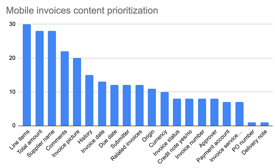
- Information Architecture Analysis — Mapped all invoice data points and user actions to understand what's essential versus contextual
- Dual Prototyping — Created two distinct approaches to test different interaction patterns
- Prioritization Workshop — Ran IA sessions with users to categorize features (Important / Nice to have / Not important)
- Iterative Testing — Conducted 6 usability testing sessions to validate assumptions
Design Inspiration: Google Maps' split-screen pattern became our north star for managing dense information on mobile.
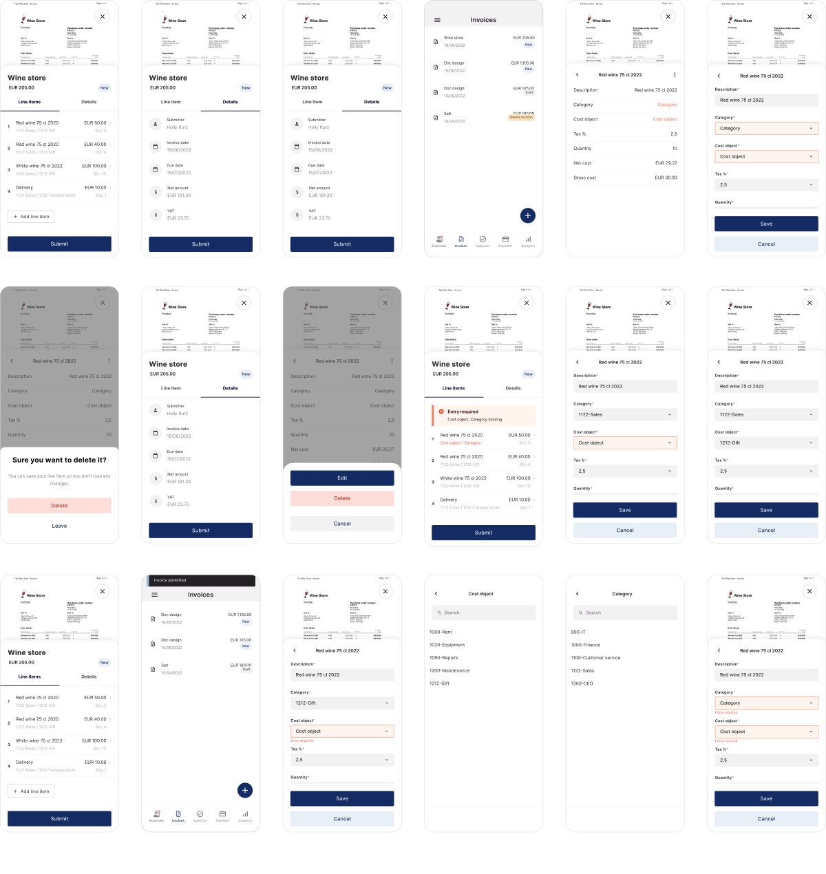
Design Approach: Two Prototypes
Prototype A: Traditional Tab-Based Layout
A more conventional approach that hid the invoice image behind a tab, requiring users to switch back and forth between the document and coding fields.
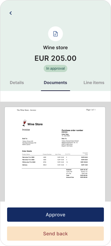
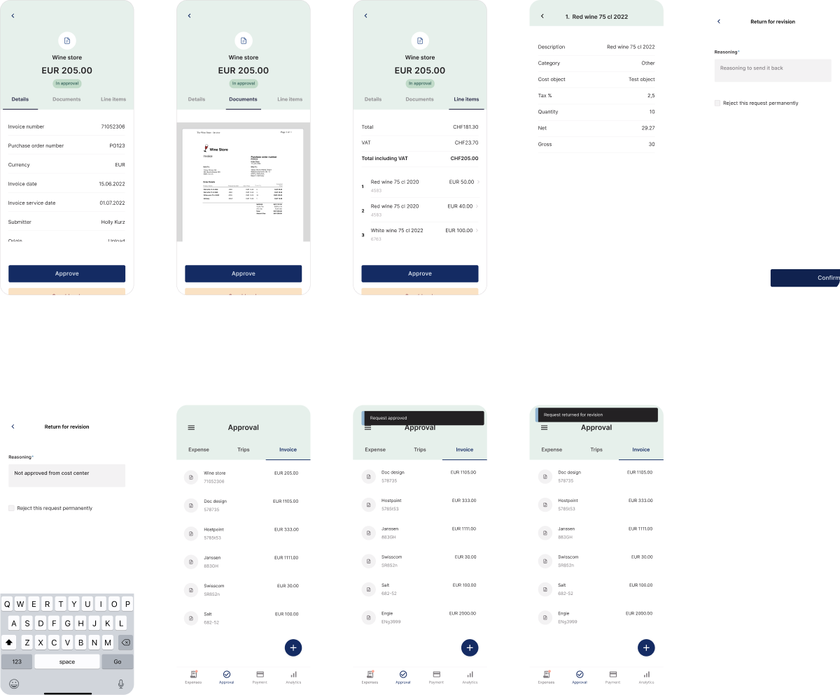
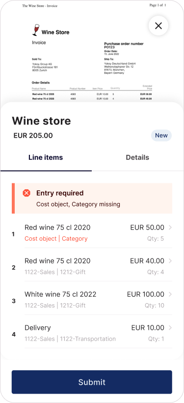
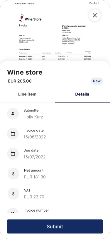
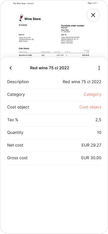
Prototype B: Split-Screen with Visual Reference
Inspired by Google Maps' ability to show the map while displaying route details, we created a design that kept the invoice image visible at the top of the screen while users coded line items and details below. This allowed users to reference the original document while entering data.
Use Case
Finance teams occasionally encounter invoices they can't code themselves. The current desktop flow lets them reassign to the original submitter for additional context. This capability didn't exist on mobile, creating friction when users were away from their desk but needed to make time-sensitive coding decisions.
Testing Insights
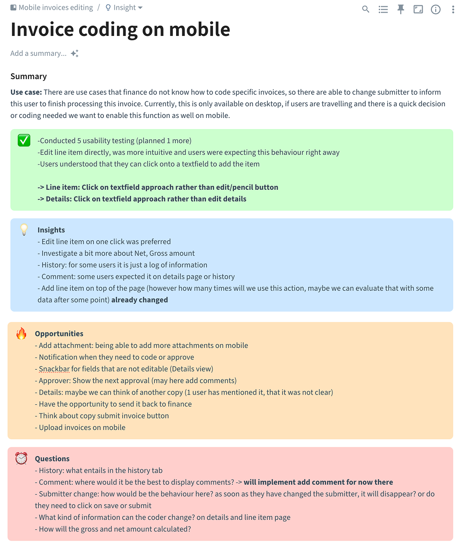
What We Tested
- 5 usability sessions completed (1 more planned)
- Two interaction patterns for editing line items
- Different placements for comments and actions
- Split-screen vs tab-based layouts

Key Findings
Split-Screen Design Dominated The Google Maps-inspired approach with the invoice image visible above performed significantly better than the traditional tab-based design. Users needed constant visual reference to the original invoice to verify amounts, dates, and vendor details. Being able to see the image while coding eliminated the friction of switching between tabs and reduced errors.
"I can just look up and check the number instead of going back and forth" — User quote from testing
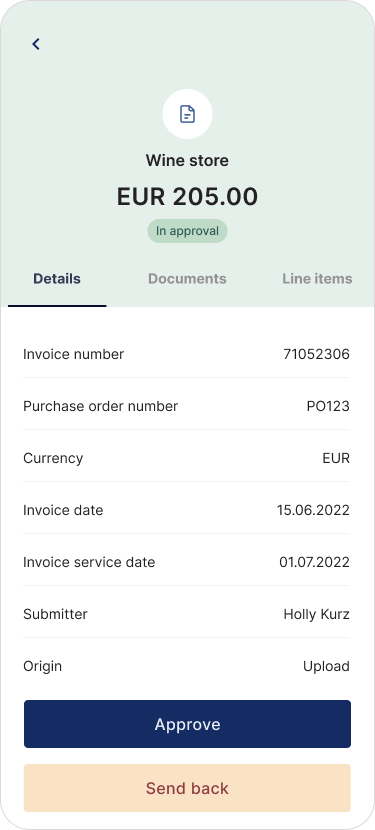
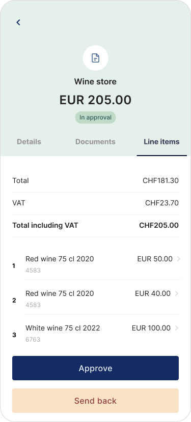
Direct Editing Wins Users strongly preferred clicking directly on text fields to edit, rather than hunting for edit buttons or pencil icons. This pattern felt more intuitive and matched their mental model.
Line Items: Tap-to-edit approach > Edit button pattern
Details: Tap-to-edit approach > Separate edit mode
Mental Models & Expectations
- Users immediately looked to tap text fields when they wanted to make changes
- Having the invoice visible meant users could compare data in real-time, catching discrepancies faster
- History tab functioned as an audit log for some users but felt like "just information" without clear action value
- Comment placement expectations varied (some expected it in Details, others in History)
- "Add line item" action worked well at the top of the page
Areas Needing Clarification
- Net vs Gross amount calculations need additional investigation
- "Details" label wasn't immediately clear to one user
- Submit button copy could be more specific
Opportunities Identified
High Priority
- Notifications when invoices require coding or approval
- Snackbar feedback for non-editable fields in Details view
- Show next approver in workflow (with option to add comments)
Medium Priority
- Add attachment capability on mobile
- Option to send invoice back to finance team
- Upload invoices directly from mobile
Under Investigation
- Comment placement strategy
- Details section copy refinement
Open Questions
Technical Behavior
- What happens when submitter is changed? Does invoice disappear immediately or after save/submit?
- How are gross and net amounts calculated in different scenarios?
Permissions & Scope
- What information can coders actually modify in Details vs Line Items?
- What belongs in the History tab beyond audit logging?
User Flow
- Where should comments live for optimal discoverability?
- How frequently will "add line item" actually be used? (Can validate with usage data post-launch)
Key Learnings
Context matters more than screen space Our biggest breakthrough came from recognizing that invoice coding isn't just data entry. Users constantly cross-reference the original document to verify information. The split-screen design sacrificed some vertical space but gained massive usability by keeping the invoice image visible. Users completed tasks faster and with more confidence because they could compare data without context switching.
Mobile users think differently than desktop users Users didn't want a shrunken desktop experience. They expected mobile-native interactions. When we tested edit buttons and pencil icons (common on desktop), users bypassed them entirely and tapped directly on text fields. This shaped our entire interaction model.
Prioritization workshops reveal what users actually need Our IA workshop forced honest conversations about feature importance. Several "must-have" features from the desktop version landed in "nice to have" when users considered their actual mobile workflows. This prevented scope creep and kept us focused on core tasks.
Good design sometimes means giving up pixels for usability The traditional approach would have been to maximize space for form fields by hiding the invoice image. But testing proved that the "wasted" space showing the document actually made users more efficient and accurate. Sometimes the best design isn't the most space-efficient one.
Test early, test often, stay flexible Running 6 testing sessions might seem excessive for a mobile feature, but each round revealed new mental models. The split-screen vs tab-based comparison only became decisive after seeing consistent patterns across multiple users. By session 5, we had clear validation for our approach.
Leave room for data-driven iteration Some questions can't be answered in testing. How often will users add line items on mobile? We documented these unknowns as opportunities to validate with real usage data post-launch. Good design acknowledges what it doesn't know yet.