When the project began, the constraints were daunting: a hard 3-month deadline to go live, no established design system, and building from absolute zero.
The team needed to create a complete invoice processing workflow that would serve multiple user roles with fundamentally different needs—from employees submitting invoices to finance teams managing complex approval flows.
The Approach
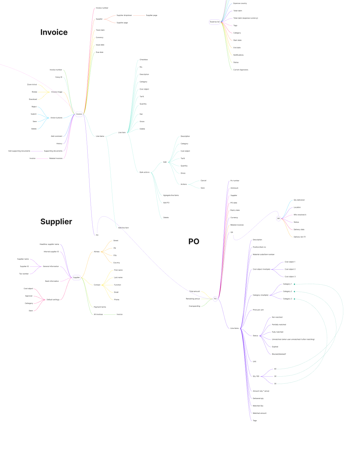
- Strategic Mapping: We began with internal Subject Matter Expert (SME) interviews to define four distinct user roles: Submitter, Invoice Reviewer, Manager, and Finance.
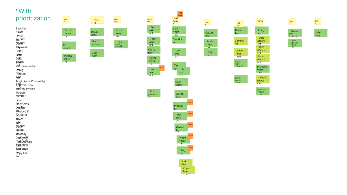
- Feature Prioritization: Card sorting was used to ensure the most critical features were built for the MVP while less vital ideas were moved to the roadmap.
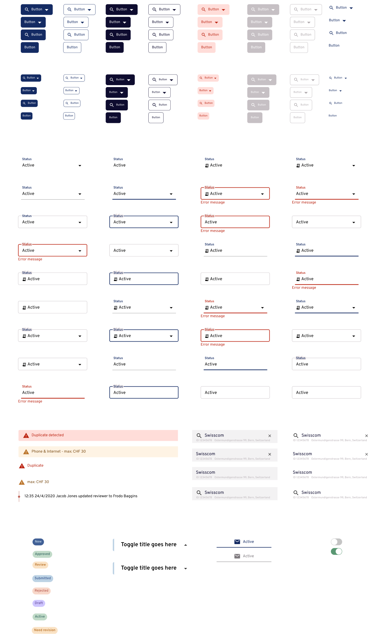
- Design system: Best way to move fast is to build infrastructure first. Instead of a full design system I opted to build just the necessary component library.
- Rapid Iteration: We implemented improvements immediately after each session, completing 8 full iterations in the time it would usually take for one.
The Lean UX Gamble
Faced with an impossible timeline, the team abandoned traditional UX methodology. Instead of running 5–10 tests before implementing changes, we adopted an aggressive iteration strategy: test one user, implement improvements immediately, then test again.
The trade-off was real. With a sample size of one, some changes actually made the experience worse. But vigilant monitoring made these missteps easy to spot and reverse. The payoff? Eight complete iterations in the time it would normally take to complete one cycle.
This approach transformed a potential failure into a dramatic success: the MVP launched on time, the product became an industry leader within 18 months, and contributed to a nine-figure acquisition.
Understanding the Problem Space
Through discovery sessions with subject matter experts, the team identified 5 distinct user roles, each with competing priorities:
- Submitters needed simplicity: just upload an invoice and get it paid.
- Suppliers want to get paid quickly and notified if something goes wrong.
- Reviewers needed precision: verify supplier matches, validate amounts, catch AI errors, and handle complex scenarios like split single line item to multiple cost objects.
- Managers needed control: to see everything affecting their department, check for duplicates across the entire system, and approve or reject with context.
- Finance needed flexibility: change virtually any field except total amounts, reroute invoices when needed, and ultimately get everything booked and paid.

Prioritization Through Card Sorting
Rather than guessing at feature importance, the team ran a comprehensive card sorting exercise that revealed a clear truth: start with headers, defer the details.
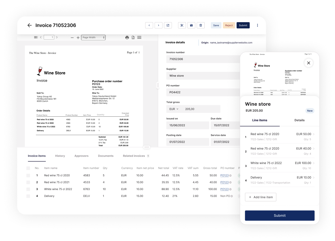
The MVP would focus on header-level information—supplier name, dates, amounts—and a robust document viewer. The entire line items category, despite being important, was explicitly marked "not MVP." This ruthless prioritization allowed the team to ship a working product that solved the core workflow, with granular itemization planned for phase two.
Design system in 12 hours
Moving fast requires solid design infrastructure, but the deadline left no room for a full system. So I put in a 12-hour day and built the minimal set of components we actually needed, all in one sitting. That foundation was enough to iterate quickly and run through multiple prototypes. After launch, we went back and built a proper design system from scratch — you can find that in a separate case study.
Design Iterations That Mattered
The team tested radically different layouts:
- Image on the right (failed—cut off line items)
- Invoice page as modal (tested)
- Full-screen modal approach (tested)
- Line items below at full width (tested)
- Action buttons in header vs. sidebar (evolved)
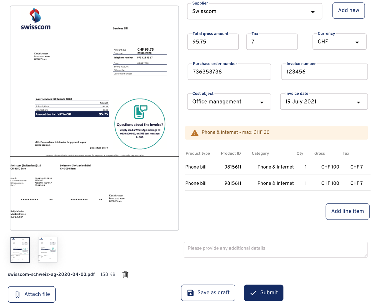
Initially, we tried an invoice modal with the image on the right, but line items were frequently cut off.
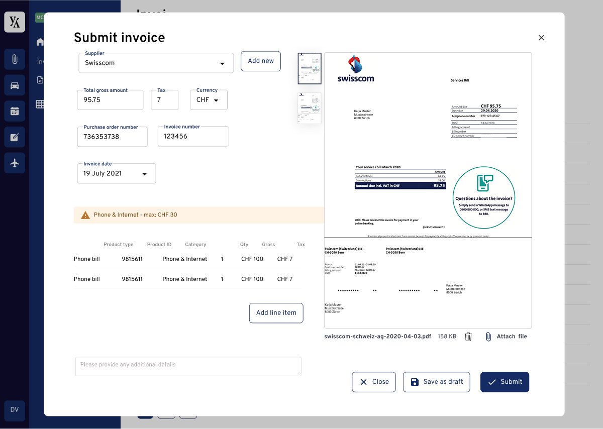
Full screen modal with image on the right performed better because it gave more space but we still had line items cut-off issues on smaller screens.
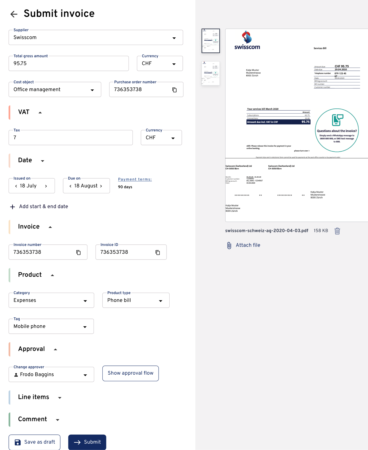
Image on the left gave us more space for line items. But action buttons were not easily visible at the bottom, especially in case of more line items. Also multi page invoices required additional click to view next page.
Sections as accordions solved some issues with space but introduced new ones by making content less discoverable. Making multi page invoices scrollable was great improvement.
At this point we had better understanding on which sections are important so we moved them to the top and out of accordions.
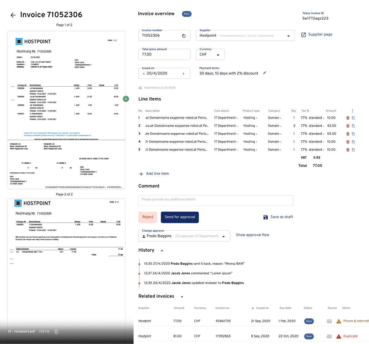
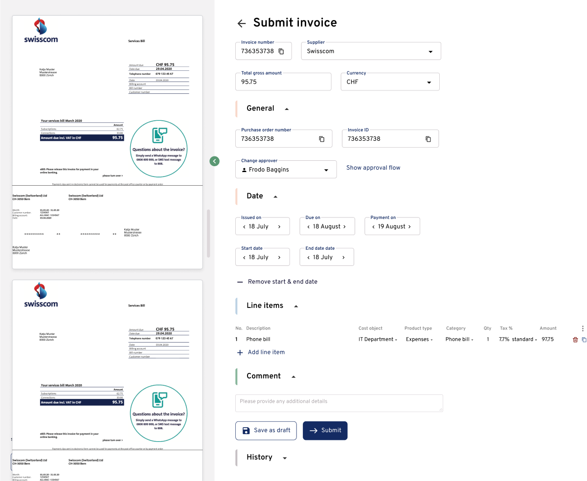
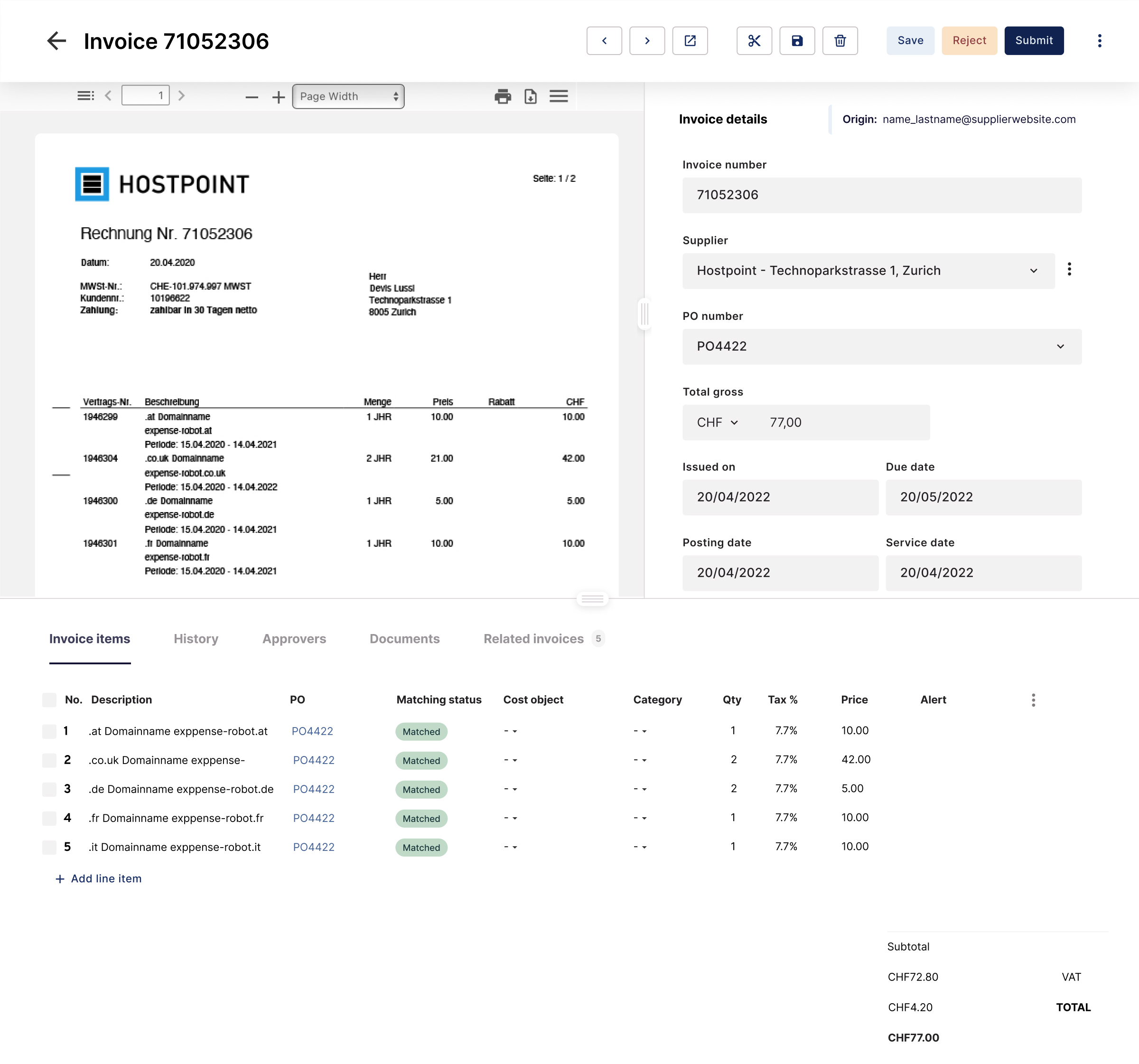
Final design: Action buttons in header with line items below at full width. We moved secondary content from accordions to tabs, making it discoverable and accessible without overloading the users.
What Real Users Revealed
The testing phase uncovered insights that would have been impossible to predict:
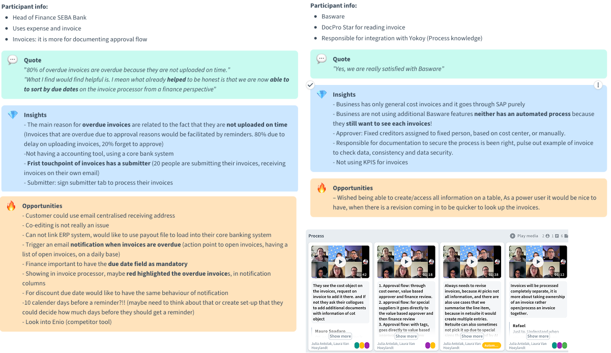
- The 80% Problem: A head of finance at a bank shared a startling statistic—80% of overdue invoices were overdue because they simply weren't uploaded on time. The solution wasn't better approval workflows; it was making due dates mandatory and sending reminders before invoices even entered the system.
- The Approver Flexibility Gap: Users needed to change approvers at the invoice level because the same vendor might need different approval chains depending on what they were buying. A website development invoice needed different approval than a maintenance invoice from the same supplier.
- The Power User Insight: One participant's feedback exposed a critical gap: "It would be nice to access all information in a table. As a power user, when there's a revision coming in, I need to look up invoices quickly."Different users needed different views. Submitters needed simplicity. Finance teams processing hundreds of invoices needed speed and data density.
- The Comment Visibility Problem: Comments were buried in history, forcing users to dig for context. As one tester put it, comments are "used for communication and paper trail"—they needed to be front and center.
Interesting features needs we discovered
Through rapid iteration, we discovered unexpected needs that became core features:
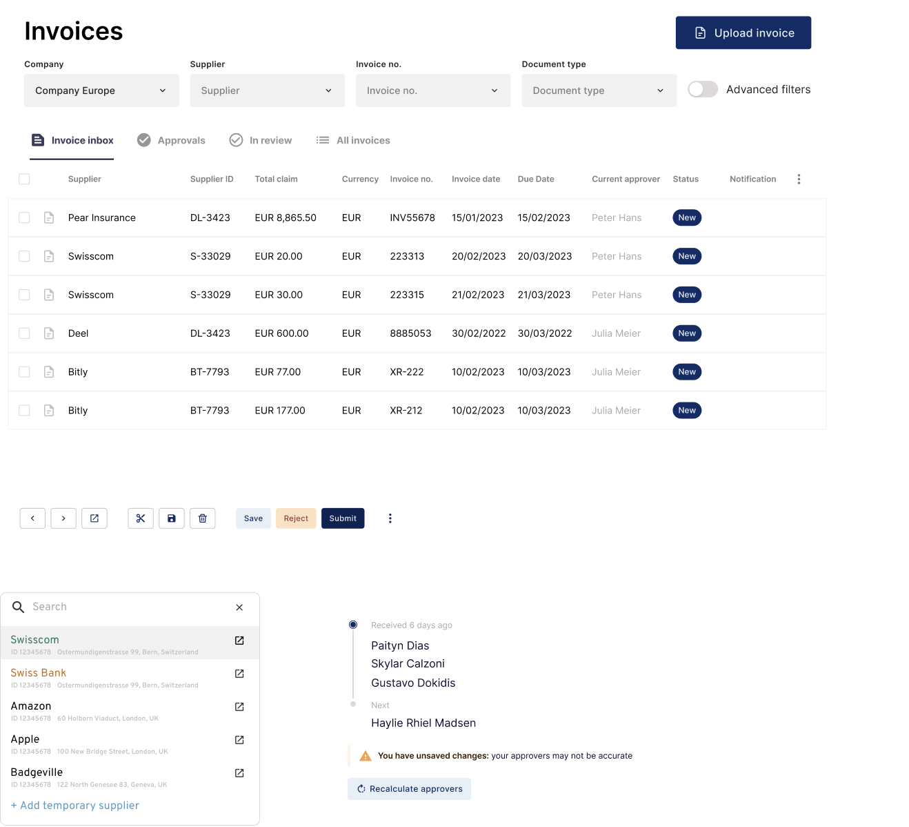
- Invoice Inbox concept for batch processing, treating invoices like emails in an inbox
- One-time supplier addition for edge cases where supplier isn't added to the master data in ERP
- AI certainty levels so reviewers knew when to double-check
- Next/previous navigation to avoid returning to table view
- Auto-load next invoice on submit to accelerate processing
- Full-screen PDF viewer optimized for dual monitors
Results That Speak
The aggressive lean UX approach delivered:
- MVP live in 3 months despite starting from zero
- Industry leader in 18 months through continuous iteration
- Nine-figure acquisition driven partly by the product's market position

What we learned
- It's ok to break established rules as long as you are aware of the risks. Testing with individual users and implementing immediately can yield more iterations and learning than traditional batch testing—if you stay vigilant about reversing mistakes.
- Talk to the people doing the work. The head of finance revealed that 80% of delays happened before invoices even entered the system. Without that conversation, the team would have optimized the wrong part of the workflow.
- Ruthless prioritization wins. Marking entire feature categories as "not MVP" feels risky, but shipping a working product that solves the core problem beats shipping nothing on time.
- Users don't know what they don't know. Critical features went undiscovered because they weren't obvious. Effective design prioritizes discoverability; it's not solely focused on feature creation.
Beyond Invoice:3 Way Matching
7 MINUTE READ
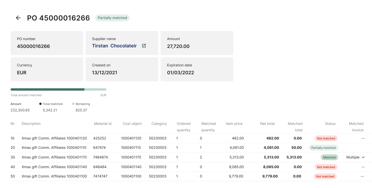
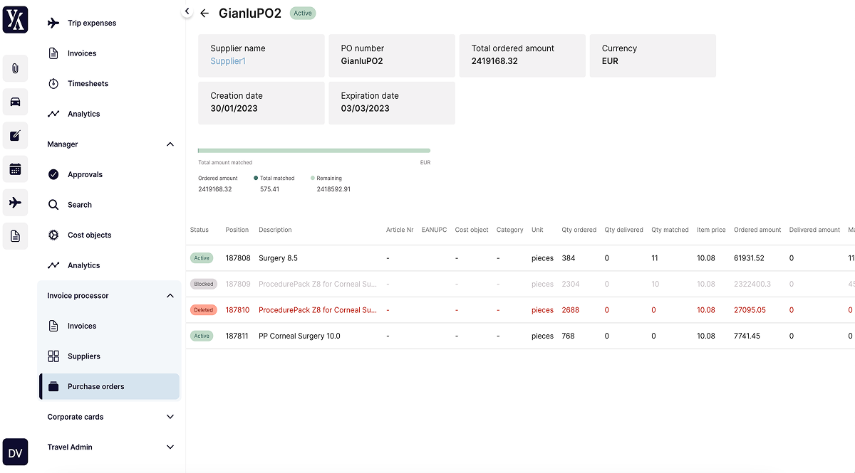
When a business orders supplies, three documents must align: the Purchase Order (what was requested), the Goods Receipt (what arrived), and the Invoice (what's being charged).
But orders often arrive in multiple shipments, creating webs of connections where one invoice line matches several delivery records.
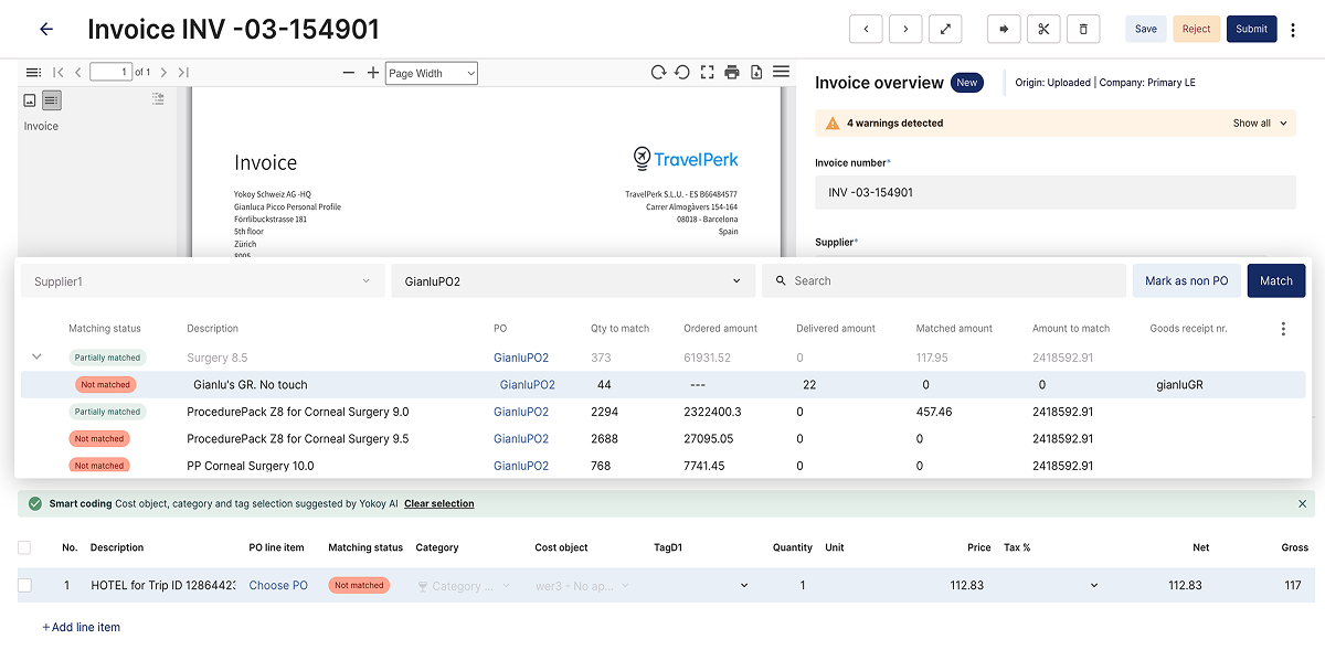
This project focuses on optimizing Purchase Order (PO) matching processes, which include two-way matching (invoice to PO) and three-way matching (PO, invoice, and goods receipt). The system aims to handle complex scenarios such as matching a single line item to multiple POs or goods receipts.
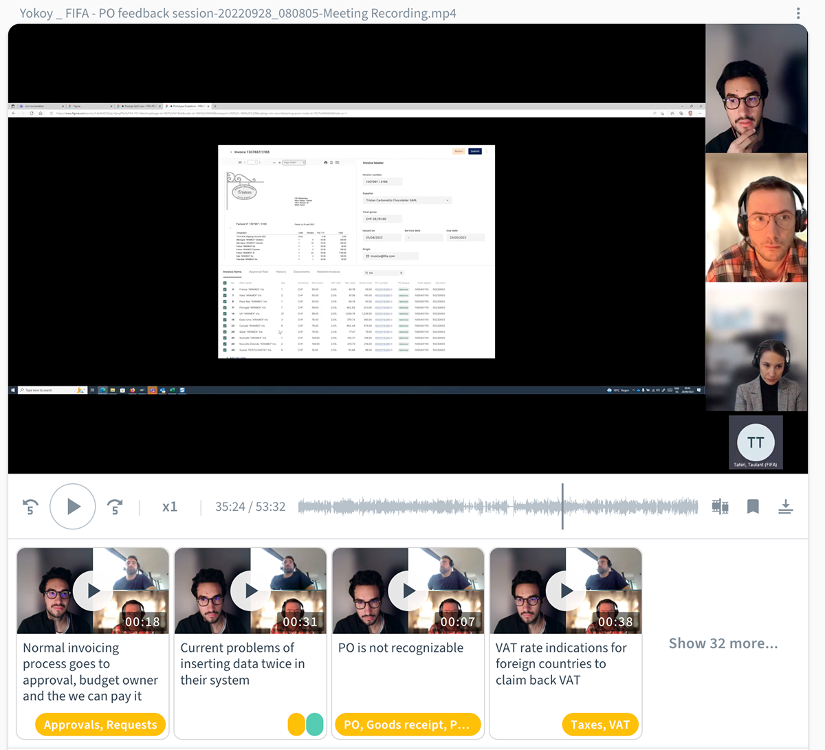
To understand customer mental models for matching, we conducted user testing using Miro mind map elements to represent invoice and PO line items. We started with open labeling to capture organic user terminology, followed by closed labeling using the most frequent terms to validate our findings.
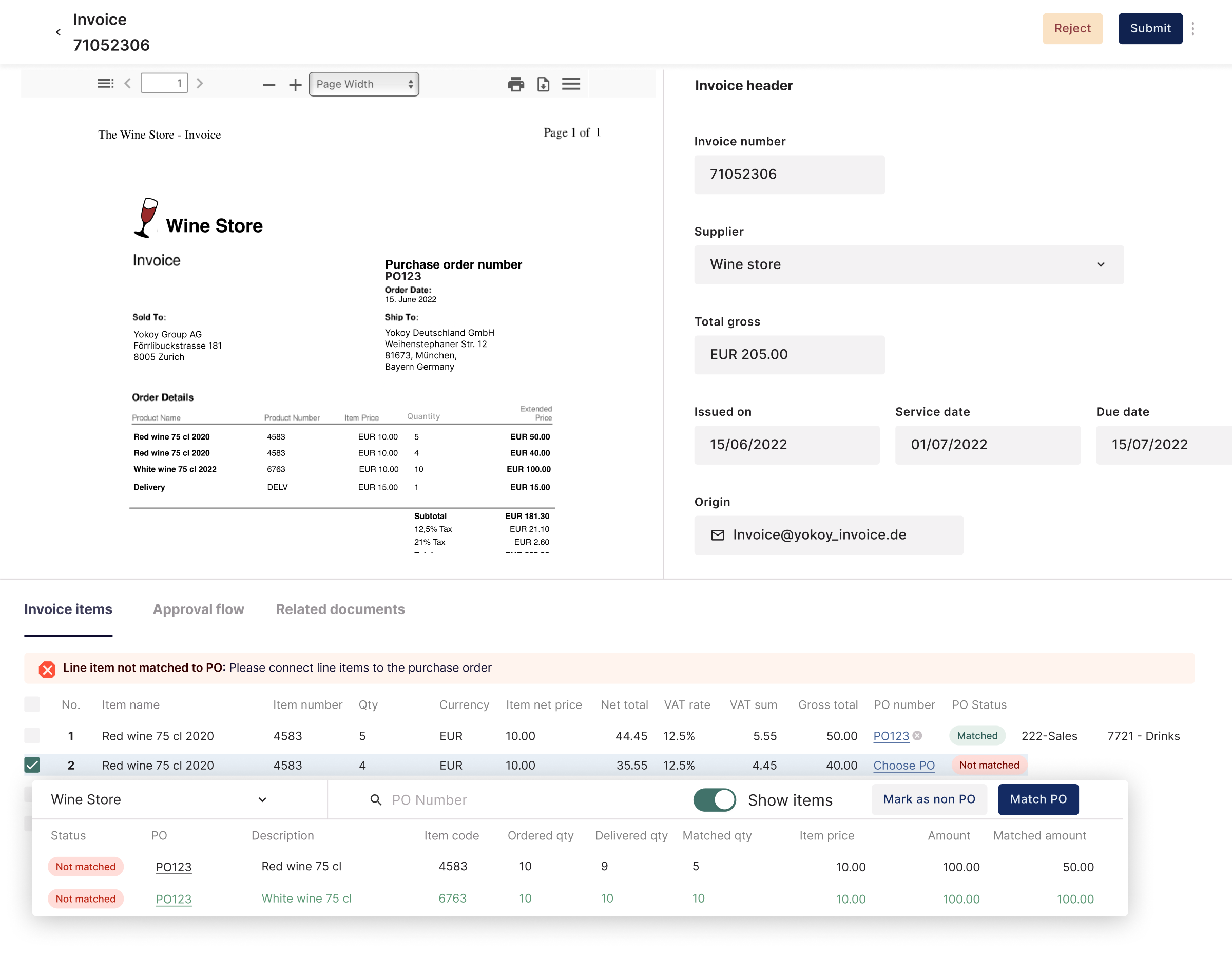
Early designs used side-by-side layouts that felt cramped with complex data. The solution? Nested accordions that work like albums and tracks, letting users drill down and click to match shipments.
Adding a draggable matching window eliminated constant scrolling between documents.
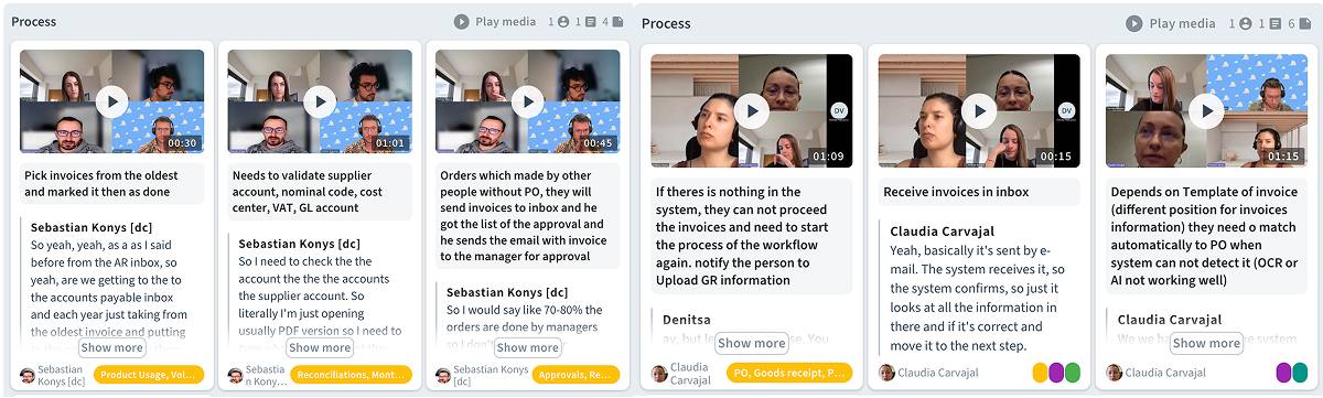
Research Methodology
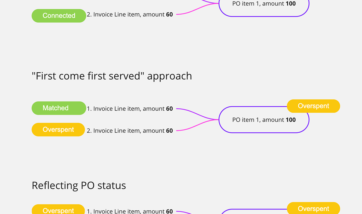
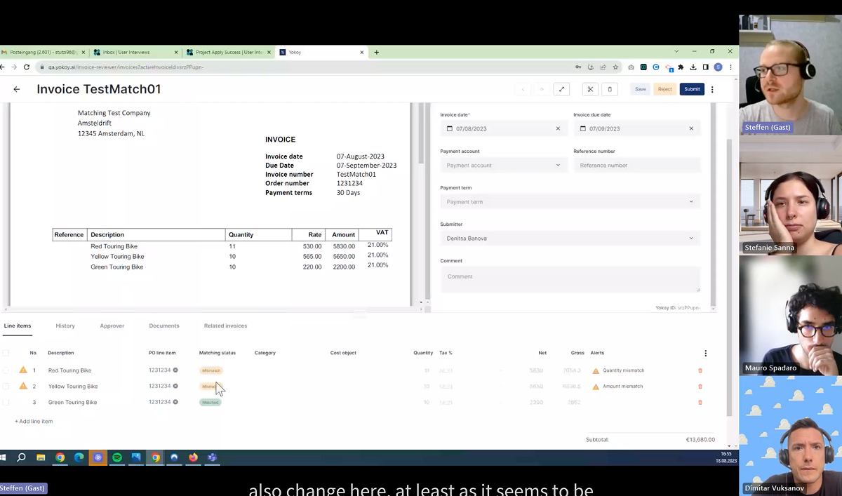
The process relied on extensive user interviews and prototype testing with finance and procurement professionals across various organizations, including FIFA, Hitachi, and Distran. Through these sessions, the team identified a range of matching states: unmatched, partially matched, fully matched, and overspent.
Key User Insights and Requirements
Testing revealed distinct priorities based on professional roles and company size.
- Matching Accuracy and Complexity: Users require the ability to match one invoice to multiple POs and handle recurring invoices.
- Data Visibility: High importance is placed on seeing net and gross amounts, supplier names, and due dates. Procurement teams specifically focus on matching quantities and prices rather than just total amounts.
- Mobile and Workflow Integration: There is a strong demand for mobile approval workflows, especially for large organizations like FIFA.
- Audit and History: A clear timeline or audit log is necessary to see who received, uploaded, or rejected a document. This helps identify where an invoice might be stuck in the process.
- Discrepancy Management: When mismatches occur, users need an intuitive way to contact the buyer or procurement team to make corrections.
Identified Challenges and Pain Points
Current systems and manual processes present several hurdles for users.
- System Performance: Existing tools are noted as being very slow, often requiring users to input data twice into both a verifier and an ERP system like SAP.
- Manual Data Coding: Finance consultants often have to manually find General Ledger (GL) accounts and cost objects because they are not always provided with the invoice.
- Notification Gaps: Important notifications are sometimes missed if they do not include deep links or attached invoices.
- Rigidity of POs: In certain industries, POs are viewed as rigid, especially for services where quantities are less relevant than total budget.
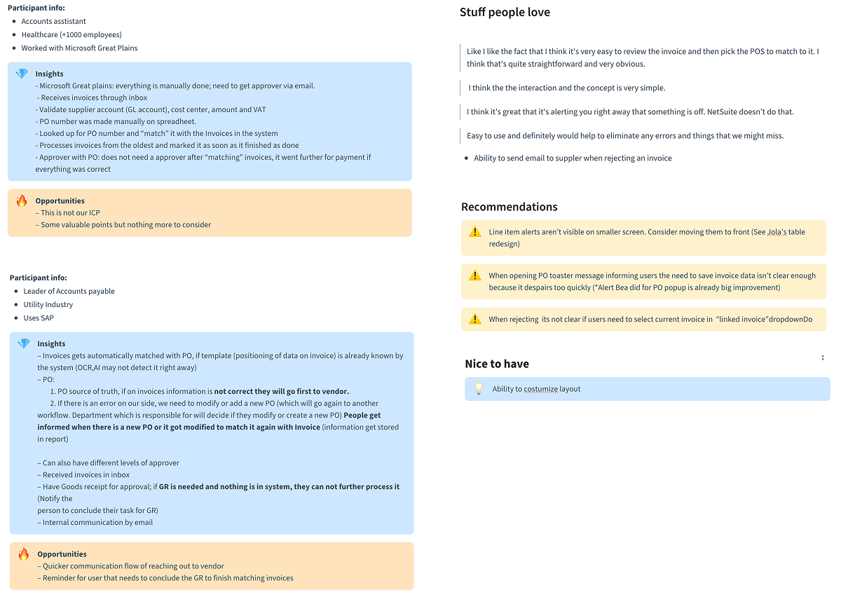
Strategic Recommendations for Improvement
Based on the feedback gathered, the following enhancements are prioritized.
- Interface Redesign: Implement a side-by-side comparison view that allows users to see the invoice and PO simultaneously without switching screens.
- Automation and Sync: Enable real-time data synchronization from ERP systems to reduce manual entry.
- Bulk Actions: Develop capabilities for bulk editing cost objects and line items to increase efficiency.
- Tolerance Controls: Implement hard tolerance limits or warning messages for overconsumption, such as a 5% threshold.
- Improved Communication: Integrate a "raise a flag" or commenting feature within the tool to allow users to tag colleagues for clarification on discrepancies.
- Document Access: Ensure that delivery notes and original PO PDFs are easily accessible within the matching screen.